| Python中Subplots画图总结,plt.subplot(), ax.plot(), plt.subplot2grid()画图实例及参数设置 | 您所在的位置:网站首页 › python中subplot mosaic › Python中Subplots画图总结,plt.subplot(), ax.plot(), plt.subplot2grid()画图实例及参数设置 |
Python中Subplots画图总结,plt.subplot(), ax.plot(), plt.subplot2grid()画图实例及参数设置
|
在上一节的matplotlib.pyplot基础学习笔记中,已经说明了画布(Figure)和坐标轴(Axes)之间的关系,在实际的可视化项目中,若在一张图中画太多的曲线,那么整幅图像可能变得比较拥挤,导致其可观性变得较差,因此常常需要在一幅图中显示多个子图(Subplots),各个子图的坐标轴范围及刻度可能不尽相同,各自图的标识等等都可能不同,均可通过代码实现不同程度的调整。 本文将给出在python中常见的子图可视化方式,并且在各个子图中设置相应的属性,更为直观的实现可视化效果。我们知道在python的画图机制中,可以直接采用plt.plot()的方式进行画图;另一方面,通过预先分配画布(Figure)及坐标轴(Axes),再在坐标轴上进行画图axes.plot()也是较为可行的方法,那么将同样的思路运用到子图的画图过程中,我们通过以下的例子来说明不同的子图画图方式。 我们将在图中实现正比例函数、二次函数、三次函数、正弦及余弦函数的可视化效果,以这5副图为例,来实现子图不同的实现方式。首先我们将这五条曲线显示在同一个图形及同一个坐标轴中,并对相应的属性进行合适的设置,以达到较好的可视化效果。 import matplotlib.pyplot as plt import numpy as np import matplotlib as mpl x1 = np.linspace(-np.pi,np.pi,200) x2 = 2*np.linspace(-np.pi,np.pi,300) y1 = x1 # linear line y2 = x1**2 # Quadratic line y3 = x1**3 # Cubic line y4 = 5*np.cos(x2) # cosin function y5 = 10*np.sin(2*x2) # sin function #Fig.1 fig,ax = plt.subplots(figsize=(12,8),dpi=100) #And dpi=100 increased the number of dots per inch of the plot to make it look more sharp and clear. plt.style.use('seaborn-whitegrid') linear = plt.plot(x1, y1) quadratic = plt.plot(x1, y2) cubic = plt.plot(x1, y3) cosin = plt.plot(x2, y4) sin = plt.plot(x2, y5) # Another way of realizing legend setting. #plt.legend((line1, line2, line3), ('label1', 'label2', 'label3')) plt.legend([linear[0], quadratic[0], cubic[0], cosin[0], sin[0]], ['linear', 'quadratic', 'cubic', '5cos(x)', '5sin(2x)'], frameon=True, # legend border framealpha=1, # transparency of border ncol=2, # num columns shadow=True, # shadow on borderpad=1, # thickness of border title='5 lines in a Figure', # title of the legend box title_fontsize=15, # fontsize of the title loc='lower right', # location of the box fontsize=13) # fontsize of the labels # annotation on the x^3 function with an arrow plt.annotate(r'$x^3$', xy=(3,27), xytext=(5,30), bbox=dict(boxstyle='square',fc='deepskyblue', linewidth=0.2), arrowprops=dict(facecolor='green', shrink=0.01, width=0.5), fontsize=15, color='white', horizontalalignment='center') # set x-axis labels ax.set_xticks(np.arange(-2*np.pi,2*np.pi,90/57.2985)) # 57.2985 is used to transfer number to radius ax.set_xticklabels([r'$-2\pi$',r'$-\frac{3\pi}{2}$',r'$-\pi$',r'$-\frac{\pi}{2}$', r'0',r'$\frac{\pi}{2}$',r'$\pi$',r'$\frac{3\pi}{2}$',r'$2\pi$'],rotation = -25) # set the limits of the x axis ax.axis([-2*np.pi,2*np.pi,-40,40]) # plot the reminder lines with black line ax.hlines(0,-2*np.pi,2*np.pi,ls='-.',color='black') ax.vlines(0,-40, 40,ls='-.',color='black') #add a inner ax # Reference website: # https://www.machinelearningplus.com/plots/matplotlib-tutorial-complete-guide-python-plot-examples/ # add another axes in the current figure: fig.add_axes() inner_ax = fig.add_axes([0.2, 0.64, 0.2, 0.2]) # x, y, width, height # the x, y is the absolute value of the figure inner_ax.plot(x1, y1) inner_ax.plot(x1, y2) inner_ax.plot(x1, y3) inner_ax.plot(x2, y4) inner_ax.plot(x2, y5) inner_ax.set(title='Zoomer', xlim=(-.4, .4), ylim=(-.02, .03), yticks = np.arange(-0.02,0.04,0.01), xticks=[-0.4,0,.4]) # title of the inner figure ax.set_title("Fig.1 Plot inside a Plot", fontsize=20) mpl.rcParams.update(mpl.rcParamsDefault) # reset to defaults plt.show()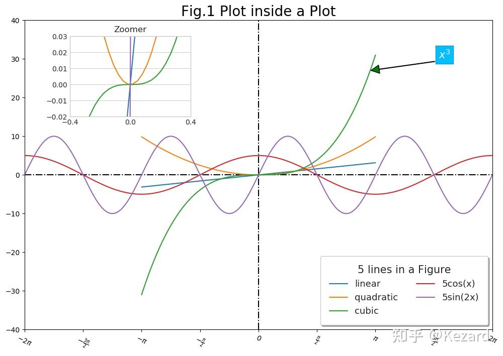 Fig.1 5 lines in one Figure Fig.1 5 lines in one Figure由于不同函数有不同的增长或消减趋势,因此在同一个坐标轴下,图形可能会显得被压缩(可以想象,若x取得较大,x的三次方的值将会变得很大,下方图形就会“黏”在一起)。为解决这一问题,我们可以将图形在局部进行放大来观测图像在某一区域的值,因此在上图中,我们添加了一个inner_axes来可视化 x\in[-0.4,0.4] , y\in[-0.02,0.03] 上的图形。 接下来,我们将各条曲线单独显示在同一副图中的不同子图中… matplotlib中,子图被后端放置在一个网格中。要创建子图,只需调用该subplot函数,并指定图中的行数(rows)和列数(cols),以及要绘制的子图的索引(索引从1开始,然后从左到右,从上到下)。可将子图放置在一个矩阵中,通过其坐标位置进行调用,如一个3 rows*3cols的图,第一排的三个图从左至右的索引为1,2,3;第二排的三个图从左至右的索引为4,5,6;其余N*N的情况以此类推。 请注意,matplotlib.pyplot 会跟踪当前活动的子图,因此,所有的画图过程均在”当前”坐标下进行。可以通过plt.gca()获得当前(subplot)坐标轴的属性,通过plt.gcf()获得当前图形的属性。 同样地,plt.cla()和plt.clf()将分别清除当前的轴和图形。 1. plot by matlab format:plt.subplot()fig = plt.figure(figsize=(12,6),dpi=100) plt.subplot(2, 4, 1) plt.plot(x1,y1,color='firebrick',linewidth=0.8,label='Linear');plt.legend(loc='upper center') plt.ylabel('y',fontsize=8);plt.xlabel('x') plt.title('Linear') plt.subplot(2, 4, 2) plt.plot(x1,y2,'.',color='blue',linewidth=0.8,label='Quadratic');plt.legend(loc='upper center') plt.title('Quadratic');plt.ylabel('y',fontsize=8);plt.xlabel('x') plt.subplot(2, 4, 3) plt.plot(x1,y3,'.',c='red',linewidth=0.8,label='Cubic');plt.legend(loc='upper center') plt.title('Cubic');plt.ylabel('y',fontsize=8);plt.xlabel('x') # Modifications and settings on this sub-figure(1,3) # 1. Adjust x axis Ticks plt.xticks(ticks=np.arange(-4,5,2),labels=[r'x1',r'x2',r'x3',r'x4',r'x5'], fontsize=10, rotation=30,ha='center', va='top') # 2. Tick Parameters plt.tick_params(axis='both',bottom=True, top=True, left=False, right=True, direction='in', which='major', grid_color='blue', grid_linestyle=':',grid_linewidth=0.8, grid_visible='on') ##Alternative grid settings #plt.grid(linestyle=':', linewidth=0.8, alpha=0.15) plt.subplot(2, 4, 4) plt.plot(x2,y4,'.',c='pink',linewidth=1.2,label='5cos(x)');plt.legend(loc='upper right') plt.title('5Cos(x)');plt.ylabel('y',fontsize=8);plt.xlabel('x') # Display the line in the range of [0,3/2*pi] plt.xlim([0,3/2*np.pi]) plt.ylim([-5,5]) plt.subplot(2, 1, 2) plt.plot(x2, y5, '--.',c='green') plt.ylabel('y',fontsize=8) plt.title('5Sin(2x)');plt.xlabel('x') plt.axhspan(0,0.1) # adjust the space between subplots...(w:width, h:height) plt.subplots_adjust(hspace=0.6,wspace=0.4) plt.grid(True,linestyle='--', linewidth=1, alpha=0.5) # add a title to the whole figure fig.suptitle('Fig.2 A Figure of 5 subplots',fontsize=16) plt.show()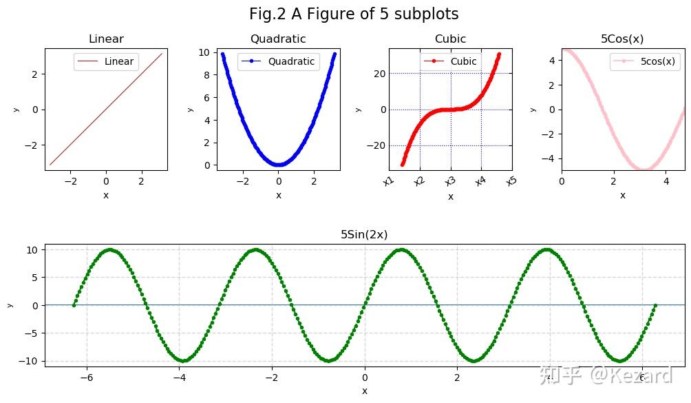 Fig.2 Subplots by matlab format Fig.2 Subplots by matlab formatplt.subplot(2, 4, 1),…,plt.subplot(2, 4, 4)为该图指定了2 rows*4 cols的子图区域,并且在上述坐标轴1,2,3,4内分别画图。不同的是,最后一个坐标轴分配指令plt.subplot(2, 1, 2),看似其和前面的指令不同,实际上到这一步将第一排的4个子图看作一个整体,他们占据了一行画图的整体区域,此时在此基础之上分配一个2行1列的区域,第1行第1列即为已画图形的这个整体,第2行第1列即为最后画的正弦函数,该函数占据了原始的4列区域。 对于第三幅图的 y=x^3 ,我们对其坐标轴,网格线等等做了相应的设置作为演示,其余各轴也可实现类似的效果。fig.suptitle()为整个图形添加了一个总的标题,实际上,每个子图都可以通过plt.title()添加一个子标题。在实际的画图过程中,因为对坐标轴,子标题等的设置,会使得各自图之间的影响收到干扰,即一副子图可能遮挡或重叠另一幅子图的标签显示,所以常常会通过plt.subplots_adjust()来调整各个子图之间的位置,wspace及hspace分别表示子图之间的水平及垂直距离。 2. plot by using plots on the axes ax.plot()# Fig.3: subplot using axes.plot # create a figure, distribute axes fig1,ax=plt.subplots(2,3,sharex=False,sharey=False,figsize=(12,6),dpi=100) # the sharex/sharey means the axes whether have the same x or y range. # the figure is divided into 6 axes, which is 2 rows and 3 cols, #the ax index is called by the matrix-like format, but the index starts from 0. ax[0,0].plot(x1,y1,"r",lw=1.5,label='Linear');ax[0,0].legend(loc='best') ax[0,0].set_ylabel('y') ax[0,0].set_xlabel('x') ax[0,1].plot(x1, y2, "b-",label='Quadratic');ax[0,1].legend(loc='best') ax[0,1].set_xlabel('x') ax[0,1].set_ylabel('y') ax[0,2].plot(x1,y3,"g-",label='Cubic');ax[0,2].legend(loc='upper center') ax[0,2].set_xlabel('x') ax[0,2].set_ylabel('y') ax[1,0].plot(x2,y4,'.',c='pink',label='5cos(x)');ax[1,0].legend(loc='upper left') ax[1,0].set_ylabel('y') ax[1,0].set_xlabel('x') ax[1,1].set_xlabel('x') ax[1,-1].plot(x2,y5,'-.',c='purple',label='5sin(2x)');ax[1,1].legend(loc='upper left') fig1.suptitle('Fig.3 A Figure of 5 subplots',fontsize=16) ax[1,-1].set_xlabel('x') ax[1,-1].set_ylabel('y') # I want to merge the first and the second axes into just one subplot that occupy 1 row and 2 cols, # but I failed and have no idea and way to realize my thoughts. Therefore, I leave the 5th axes empty. # adjust the space between different subplots. fig1.subplots_adjust(hspace=0.4,wspace=0.25)# width and height plt.show()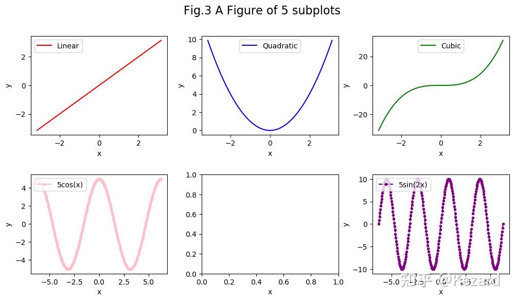 我想把最后一行的第一个和第二个坐标轴合并成一个占1行和2列的图,但是我没有找到合适的方法在这种画图方式中实现这样的想法。因此,第五幅图为空。 3. Subplots by Subplot2grid plt.subplot2grid()将子图的绝对位置划分到一个类似矩阵的状态中,通过位置进行各个坐标轴的调用 在之前对各个坐标轴属性进行设置的时候,有很多步骤是相同的,因此我们在这里预先定义一个对坐标轴进行参数设置的函数,待会儿直接进行调用。 # subplts by subplot2grid #https://matplotlib.org/3.3.1/gallery/userdemo/demo_gridspec01.html#sphx-glr-gallery-userdemo-demo-gridspec01-py # function on annotate the axes def annotate_axes(fig): for i, ax in enumerate(fig.axes): xmin, xmax, ymin, ymax = ax.axis() ax.text((xmin+xmax)/2, (ymin+ymax)/2, "ax%d" % (i+1), va="bottom", ha="center",fontsize=25,color='hotpink') ax.tick_params(labelbottom=True, labelleft=True) ax.legend(loc='upper left',fontsize=15) ax.set_xlabel('x-label', fontsize=12) ax.set_ylabel('y-label', fontsize=12) ax.set_facecolor('whitesmoke')在该种方式中,我们通过利用plt. subplot2grid()的方法来指定子图的个数,并且调整各个子图在图中的绝对位置,使得整个图形的分配如下图所示:  实现代码如下所示: # create the figure. fig1 = plt.figure(figsize=(12,10),dpi=90) # 3*3 figure, index starts at 0 # the 0 row 0 col ax(1 row 1 col in reality) occupied the column in 3 spans, # so the first row is distributed to ax1. ax1 = plt.subplot2grid((3, 3), (0, 0), colspan=3) ax1.plot(x2, y4, '.-',c='pink',label='5cos(x)',lw=0.8) ax1.set_xticks(np.arange(-2*np.pi,2*np.pi,90/57.2985)) ax1.set_xticklabels([r'$-2\pi$',r'$-\frac{3\pi}{2}$',r'$-\pi$',r'$-\frac{\pi}{2}$',r'0', r'$\frac{\pi}{2}$',r'$\pi$',r'$\frac{3\pi}{2}$',r'$2\pi$'], rotation = -25) # the 1 row 0 col ax(2 row 1 col in reality) occupied the column in 2 spans, # so the second row & first 2 colunms is distributed to ax2. Other cases are the same. ax2 = plt.subplot2grid((3, 3), (1, 0), colspan=2) ax2.plot(x2, y5, '--.',c='purple',label='5sin(2x)') ax2.set_xticks(np.arange(-2*np.pi,2*np.pi,90/57.2985)) ax2.set_xticklabels([r'$-2\pi$',r'$-\frac{3\pi}{2}$',r'$-\pi$',r'$-\frac{\pi}{2}$',r'0', r'$\frac{\pi}{2}$',r'$\pi$',r'$\frac{3\pi}{2}$',r'$2\pi$'], rotation = -25) ax2.set_yticks(np.arange(-10,11,2)) ax3 = plt.subplot2grid((3, 3), (1, 2), rowspan=2) ax3.plot(x1, y3, "g-",label='Cubic') # Get the limits of the axis xmin,xmax,ymin,ymax = ax3.axis() ax3.hlines(0,xmin,xmax,ls='-.',color='black') ax3.vlines(0,ymin, ymax,ls='-.',color='black') ax3.tick_params(axis='both', which='minor', bottom='on') ax4 = plt.subplot2grid((3, 3), (2, 0)) ax4.plot(x1, y1, "--.",lw=1.2,color='darkgoldenrod',label='Linear') ax5 = plt.subplot2grid((3, 3), (2, 1)) ax5.plot(x1, y2, "b-",label='Quadratic') annotate_axes(fig1) # plt.tight_layout() arranges the subplots in a tight format which is the same # setting with we proceeded by fig.subplots_adjust(wspace=,hspace=) above plt.tight_layout() #The plt.suptitle() added a main title at figure level title. plt.title() #would have done the same for the current subplot (axes). fig1.suptitle('Fig.4 Different lines in a Figure',fontsize=16,color='slateblue',verticalalignment='bottom',horizontalalignment='center') plt.show() Fig.4 Subplots by subplot2grid() Fig.4 Subplots by subplot2grid()通过上面的例子,我们平时在python中画子图的方式可以归结为plt.subplot(), ax.plot(), plt.subplot2grid()共计三种形式,在平时的学习中,可选定其中一种方法进行熟悉并掌握,从个人的使用心得而言,最后一种方式plt.subplot2grid()便于设置各个子图的绝对位置(从矩阵的角度进行理解), 更利于调整子图的位置。 完… |
【本文地址】